Frever Web Redesign
When the Frever app underwent a redesign with a new brand identity, the official website still reflected the old design, creating a disconnect between the app and website experience.
To address it, I proposed aligning the website with the app’s new branding for a seamless user experience. I led the project by conducting research, designing the layout, building the flow structure, creating a prototype, and collaborating with developers. This ensured a consistent and cohesive brand experience for users
Role: UI design, UX design
Timeframe: Oct 2020 - Sep 2023
Team: Solo project

Design Process.

Heuristic
Evaluation.
I started with evaluating the website using Jakob Nielsen’s 10 principles for interaction design. The assessment revealed that the previous website was confusing and inconsistent. The primary challenges were related to design consistency, insufficient information, and missing features.
Old website
01 - Consistency & Standard
The old Frever website had an inconsistent design compared to the Frever app. For instance, while the Frever app features a dark theme, the old website had a bright theme. Additionally, the Frever app predominantly uses round shapes and gradient colors, whereas the old website primarily employed lines and sharp shapes. All of these small details make the users feel confused about the whole Frever brand identity.
02 - An Aesthetic & Minimalist Design
The old Frever website was cluttered with some unnecessary pages. For instance, it placed ‘Department information’ page in the middle step of ‘Career’ page and the ‘Opening position’ page, which caused some confusion. Additionally, cluttered images made the page looks unclean and messy.
03 - Visibility of System Status
The top navigation bar lacks distinctive color changes when users switch from one page to another, making it challenging for users to easily ascertain their current position within the navigation flow.
Problems
& Solutions.
I concluded the existing problems and proposed the solutions to each problem to ensure the design process remains focused, collaborative, and effective.
Problem - 01
The old website had a different design style compared to the Frever app, and these contrasting styles made users confused about whether they were on the correct website.
Problem - 02
Potential content creators found it unclear to comprehend the application process for the creator program and the support they could receive from Frever upon acceptance.
Problem - 03
The lack of information hinders job seekers in understanding the company culture. Moreover, the introduction of department details midway through the application process adds confusion about whether they are selecting the right option.
Problem - 04
Basic information, such as privacy policy, community guidelines, cookie policy, FAQ, etc., lacks a clear structure, making it difficult to locate.
Solution - 01
The redesign of the new website aims to establish consistency with the Frever app's design style. This involves following the same design guidelines, including color palettes, font family, and other visual elements.
Solution - 02
Improving the content creator program involves redesigning the application process guide, ensuring transparent communication of post-acceptance support, and enhancing the FAQ page for better user understanding.
Solution - 03
Streamlining the application process, providing a presentation of company culture information, and ensuring clearer communication and better organization of information.
Solution - 04
Providing a clear structure and hierarchy of basic information, making it easier to navigate.
Comparative
Analysis.
To gain a deeper understanding of the official websites of various social media platforms, I conducted a comparative analysis of three widely used social media websites. This analysis focused on summarizing the basic elements common to all these websites and identifying ‘nice to have’ features.

Persona.
To aid the design team and stakeholders in comprehending the needs and behaviors of Frever users, personas are crafted to help decision-making, with a crucial emphasis on ensuring alignment with the expectations of the intended audience.


Sketches.
I brainstormed and translated ideas into rough sketches, integrating key features into page layouts.

Low-Fi
Prototype.
After sketching, I created low-fidelity prototype. It serve as a tangible representation that helps other designers and stakeholders to understand the basic structure, and facilitated early-stage feedback and iteration.

Typeface & Colors
abcdefghijklmnopqrstuvwxyz
ABCDEFGHIJKLMNOPQRSTUVWXYZ


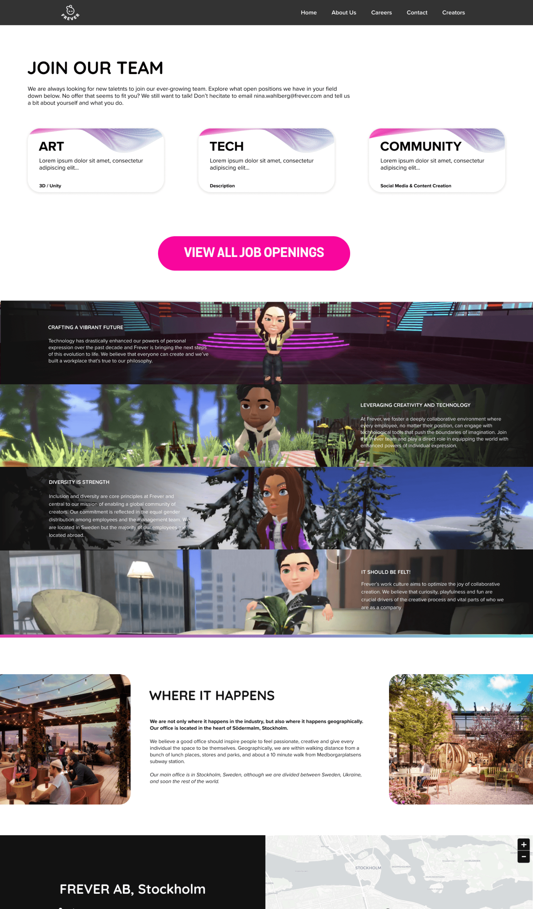
Hi-Fi
Prototype.
Finally, I compiled all refined elements to create a visually appealing website. The end result features clear navigation, maintains a consistent design style with the Frever app, and, most importantly, conveys a distinct brand identity.


